Quick Overview
Project Details
Role:
Web / UI Designer,
End-to-end design ownership,
Custom Illustration.
Scope:
Landing page design (end-to-end visual)
Tools:
Figma
Industry:
AI Automation / SaaS
Target Users:
Small and large business owners
Goal:
To design a landing page that explains, attracts, and converts across multiple audience types.
Team:
Sreyam Chatterjee (Team Lead)
Rupali Naha (Project Manager)
Problem
A complex AI product needed a single landing page to educate, build trust, and convert visitors ranging from small business owners to enterprise buyers.
Solution
Impact
The page successfully launched and went live. It gave the product a credible market presence from day one. The clear pricing structure and live agent demo reduced the need for manual sales calls — letting the page sell the product autonomously, 24/7.
Back Story of AutoChat AI
AutoChat AI is an AI automation platform that combines a centralized CRM, automated follow-up workflows, and allows elite AI voice & chat agents to help businesses scale their sales operations without growing their headcount. The product is powered by GoHighLevel (GHL) and integrates AI models from OpenAI and Retell AI.
Client Requirements
The product had three distinct capabilities — CRM Centralisation, Workflow Automation, and AI Agent Deployment — each complex enough to be a standalone product. The client wanted all three to feel like one coherent, desirable solution in the landing page. Here are few more request from the client:
Clarity & Sophistication With Dark Theme
Needed to feel cutting-edge without losing non-technical visitors.
Had to resonate from solo business owners to enterprise buyers simultaneously.
Needed to feel cutting-edge without losing non-technical visitors.
Needed to feel cutting-edge without losing non-technical visitors.
Challenges Faced
Introduce
Needed to feel cutting-edge without losing non-technical visitors.
educate
Educate those audiences on how it works.
convert
Convert both cold and warm visitors into demo requests.
Product Deep Dive - Research
Worked closely with the client to map the actual user journey of the existing software. The three-step structure — Centralize → Automate → Capitalize — directly mirrored how a real user would onboard and use the platform. Aligning the page narrative with the actual product logic was a deliberate UX decision, not a copywriting choice.
3-step structure that mirrors how a real user would onboard and use the platform.
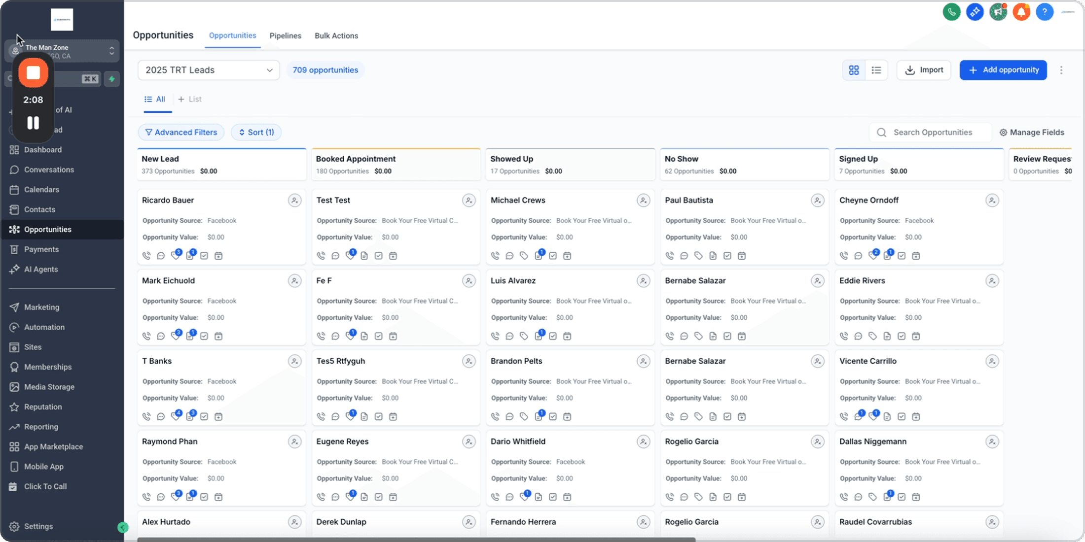
Centralized CRM Screen
All communication channels, sales & Marketing efforts.

Easy Capitalization
With elite level text & Voice AI agents.
Design Decision - Information Architecture
The page was structured to mirror the user's psychological journey:
Mental Model Alignment
(Nielsen's Heuristic)
The page structure mirrors how users would actually think about and adopt the product, reducing cognitive friction. It has a match between system and the real world.



A
Hero
Grabs attention & lands the value proposition in under 5 seconds.
I
How It Works
Build understanding of the product to create interest.
D
Pricing
Removes anxiety early, and shows accessibility.
D
Test Agents
Low-friction conversion for curious visitors. Helps build trust.
A
CTA
Final push for high-intent visitors.
AIDA Model
This sequencing follows the AIDA model
mapped across the scroll experience.
Attention
Interest
Desire
Action
Visual Design System
The dark UI although was a client’s requirement it did help us get a tech savvy look for the landing page. We incorporated the colors and typography of the existing logo to maintain continuity and trust. The colors helped us achieve a Premium, AI-native look.


Section Breakdown
Grabbing Attention - Hero Section
It quickly grabs attention while highlighting the key services, scale and sell. The text and the button styles maintain a clear hierarchy to avoid confusion and gives a dirsction to how users scan the banner.

Product Explanation - ‘How It Works’ section
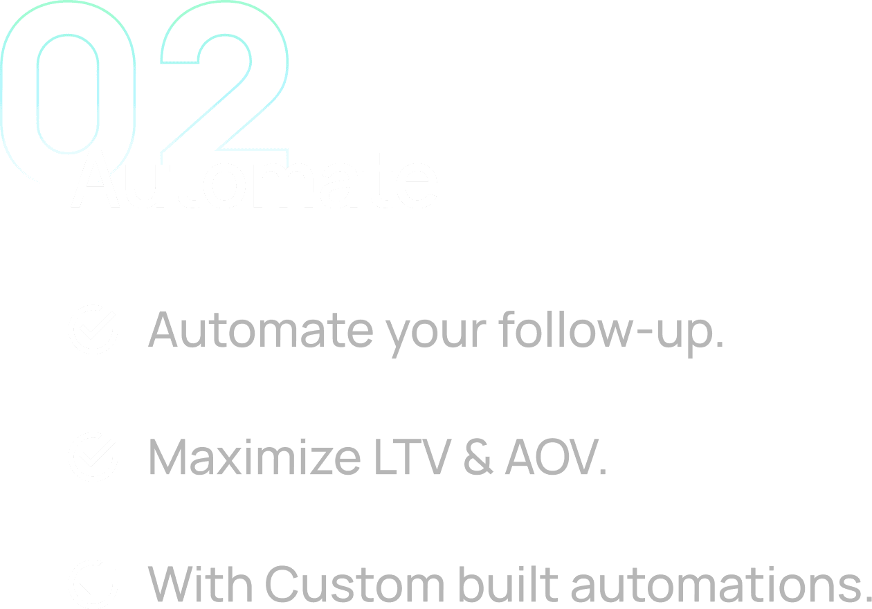
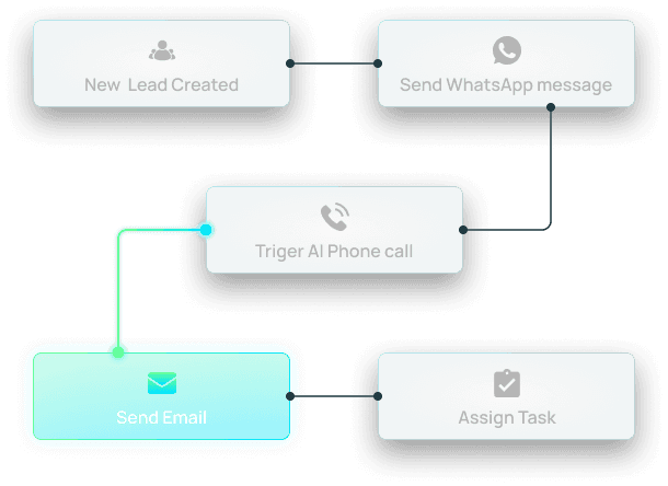
As per the above mentioned analysis of the user's psychological journey while using the product this section mirrors the three-step structure — Centralize → Automate → Capitalize. It communicates each major function of the software in a simplified manner with custom made illustration.
Each illustration was purposefully built to help users understand each step even, before reading a single word.
Centralize
Needed to feel cutting-edge without losing non-technical visitors.
Designed a workflow diagram showing trigger-based automation logic.
Created a simplified version of voice AI chat interface demonstrating a live in-call AI assistant conversation.




Transparency to build Trust - ‘Pricing’ section
Showing clear pricing options upfront to build trust. The client was also willing to provide a free trial for lower-friction conversion path for visitors not yet ready to book a demo, hence further strengthening the trust.


Call to Action
Tone shifts from informational to motivational — "Liberate Yourself & Your Team." By this point the user understands the product and urging them to take action is the final job.

Design Impact
Product Credibility
Delivered a market-ready landing page that established the product's credibility from day one.
The custom illustrations made a technically complex product feel immediately understandable — reducing the cognitive load that typically causes drop-off on AI product pages.
More Client Conversion
Dual CTA structure served both high and low-intent visitors without conflict.
Clear public pricing reduced reliance on manual sales conversations, enabling the page to convert autonomously,


Reflections
What worked
Dark Visual Language
The color theme stood out sharply against competitor pages.
Three-step narrative gave the page a logical backbone that made complexity feel approachable.
It became the strongest trust-building element on the page.
The free trials for chat and call agents allowed more clients to test it and build trust on the product. Which resulted in more clients actually signing up.
What I'd do differently
User Testing
Push for at least one round of user testing with a non-technical small business owner — the How It Works illustrations, while strong, may carry too much cognitive load for first-time visitors unfamiliar with CRMs. Due to time constraints and company (Webskitters) policies user testing was not possible.
Since the product was new our client did not have any real client testimonial. Presence of which in the landing would have added more value to the product.