hypothetical . Mobile App . case study

Explore - A Travel
Itinerary Planning App

Explore - A Travel
Itinerary Planning App

Reducing trip-planning complexities so travelers can spend less time organizing and more time exploring.

Reducing trip-planning complexities so travelers can spend less time organizing and more time exploring.

SKILLS:

*NOTE: ‘Property Deals’ is a placeholder name. Due to a signed NDA with Webskitters, the client's actual brand name cannot be disclosed. This is a real project completed during my tenure there.

SKILLS:

UX Research

UX Research

Wireframing

UI Design

UI Design

SKILLS:

UX Research

Wireframing

UI Design

Quick Overview

Project Details

Role:

UX Researcher
UX/UI Designer
End-to-end design ownership.

Scope:

End-to-end UX (Research → Wireframing → UI Design)

Tools:

Figma, Google Form

Industry:

Travel & Tourism

Target Users:

Travel Enthusiasts (Mainly 23 - 38 age)
Travel Planners/Agencies
Travel Bloggers

Goal:

To simplify trip planning through AI-powered, mood-based destination discovery and itinerary suggestions.

Team:

Ashutosh Jha (Mentored from Kaarwan)

Problem

As per reports 58% of travelers feel overwhelmed by too many choices, and 71% feel anxious even after booking. Trip planning — something that should spark excitement — has become a stressful, time consuming & source of decision fatigue, with users juggling multiple apps.

Solution

Explore is a mobile travel planning app that replaces tab-switching chaos with a single platform to plan travel itinerary efficiently and easily. It suggests personalized itinerary, and allows planning together with tripmates and share travel updates with loved ones.

Impact

Usability testing across 10 participants achieved an 87% task completion rate for the core trip-planning flow. Planning time reduced noticeably between iterations, & 9 out of 10 participants felt it to be easier and were confident planning for a destination compared to their usual process.

58% of Travelers Are Overwhelmed — Here's Why...

58% of Travelers Are Overwhelmed — Here's Why...

Travelling gives us some of the best memories. However, planning and organizing that perfect trip can be a daunting task. According to Travelport's 2024 State of Modern Retailing Report (PAX News, 2024):

Travelling gives us some of the best memories. However, planning and organizing that perfect trip can be a daunting task. According to Travelport's 2024 State of Modern Retailing Report (PAX News, 2024):

58%

58%

Of travelers feel overwhelmed by the sheer volume of choices.

Of travelers feel overwhelmed by the sheer volume of choices.

71%

71%

Feel anxious about whether they made the right decision — even after booking.

Feel anxious about whether they made the right decision — even after booking.

60%

Spend 1–4 hours planning a single trip, with over a third spending 5+ hours.

Spend 1–4 hours planning a single trip, with over a third spending 5+ hours.

The modern traveler isn't short of options — they're drowning in them. Planning a trip today means -

The modern traveler isn't short of options — they're drowning in them. Planning a trip today means -

Scrolling through endless reels
Juggling multiple apps
Jump between review sites, travel blogs
Booking costly travel agents

And despite all that effort, the experience still remains unsatisfied, and time consuming.

And despite all that effort, the experience still remains unsatisfied, and time consuming.

Planning a trip can feel siloed, disjointed and overwhelming as consumers grapple with the huge volume of content from competing travel brands."

Planning a trip can feel siloed, disjointed and overwhelming as consumers grapple with the huge volume of content from competing travel brands."

Planning a trip can feel siloed, disjointed and overwhelming as consumers grapple with the huge volume of content from competing travel brands."

Accenture Travel Practice, 2024

Accenture Travel Practice, 2024

The problem Explore App sets out to solve isn't a lack of travel inspiration. It is to solve the anxiety and friction standing between curiosity and a trip.

Studying the existing market - Competitive Analysis

I tried understanding the existing ways of planning a trip. To plan an itinerary, the best thing to do would be -

Benchmarking

List Selection

List Selection

List Selection

Decide all the places/activities as per your interest and time frame.

Categorize

Categorize

Categorize

Categorize them day-wise depending on their location and distance.

Finalize

Finalize

Finalize

Check availability and make necessary reservations.

I also analysed five existing travel apps — TripAdvisor, Tripit, Wanderlog, Sygic, and MakeMyTrip — mapping their core features against four key user needs.

I also analysed five existing travel apps — TripAdvisor, Tripit, Wanderlog, Sygic, and MakeMyTrip — mapping their core features against four key user needs.

Available

Available

Limited

Limited

Unavailable

Unavailable

The audit revealed a consistent pattern:

Booking vs Suggestions

The more an app focused on bookings, the less it helped with discovery.

Rarely a Community

Community features were rare.

No personalization

None of them were personalized or adapted to the user's mood, travel style, or context.

Juggling screens

No app connected all four into one coherent journey.

Asking the right Questions - Qualitative Analysis

I curated a set of questions to understand the pain points and requirements of my target audience by conducting direct interviews. Four core questions guided the conversations:

Responses that surfaced repeatedly

Responses that surfaced repeatedly
“While googling about a place I have to go through n no. of websites as it is hard to get all information from a single platform.”
“For me searching for an authentic local food place takes time”
“Specially if I am travelling in group taking care of everyone’s interest becomes a bit tricky.”
“It will be helpful for everyone if the app is efficient and effortless with a simple interface.”

Analyzing the Survey report - Quantitative Analysis

I have surveyed around 50 people* and tried to cover a varied range of age groups. As per travel statistics, people in the age group 23-38 travel the most, hence they occupy the larger part of the survey. Depending on the response of the interview I formed the survey questions.

Survey Data

Survey Data

Problems faced while preparing Itenerary

*NOTE: With a sample size of 50 (due to constraints of a solo project), these findings are early guiding insights rather than statistically conclusive. A larger, more diverse sample would be needed to validate these patterns at scale. However, since the findings aligned closely with the qualitative interview responses and the existing research datas, it suggests that the patterns are still genuine.

User personas based on research findings

Based on research findings, I developed two personas representing the primary user segments — a family traveller and a solo adventure seeker. These personas guided every design decision throughout the project.

Nate Diengdoh

family planner

Age:

38

Gender:

Male

Location:

Shillong

Profession:

Sales Manager

Prefers:

Family Trip

“Travel becomes more fun when accompanied by friends and family.”

“Travel becomes more fun when accompanied by friends and family.”

“Travel becomes more fun when accompanied by friends and family.”

Nate Diengdoh

family planner

Age:

38

Gender:

Male

Location:

Shillong

Profession:

Sales Manager

Prefers:

Family Trip

About

Always busy with his work. Once every year, he takes time out for his family to go on a week-long trip. His daughter prefers zoos, museum, etc. and son likes adventure places. However, Nate just wishes for a relaxing trip.

Personality
Pain Points
  • Filtering out places that interest the whole family.

  • Too much time spent researching, he’s already a busy person.

  • Managing group expenses and travel documents.

Needs
  • Easy & quick filters to find places for mixed interests.

  • Budget tracking and group planning feature.

  • Document checklist and online booking in one place.

Kaira Singhania

Solo Adventurer

Age:

25

Gender:

Female

Location:

Delhi

Profession:

Designer

Prefers:

Solo Traveler

“I wish I could plan my trips more efficiently even on very short notice.”

“I wish I could plan my trips more efficiently even on very short notice.”

“I wish I could plan my trips more efficiently even on very short notice.”

Nate Diengdoh

family planner

Age:

38

Gender:

Male

Location:

Shillong

Profession:

Sales Manager

Prefers:

Family Trip

About

Loves to travel, trek, & explore new places. She is a designer in a MNC. Almost once every three months she goes for a workation. She is energetic and adventurous. She enjoys experiencing local culture, food, tradition, etc.

Personality
Pain Points
  • Has to visit many websites to research a single trip.

  • Hard to find authentic local information for remote areas.

  • Safety concerns when travelling alone.

Needs
  • All trip data in one platform.

  • Easy interface to plan itineraries on short notice.

  • Safety info. & emergency contacts at a click while traveling.

Empathy Mapping

To go beyond surface-level pain points, I built an empathy map for Kaira, to understand a real travel scenario of how a poorly planned itinerary can effect one.

Key takeaways from the empathy map

Key takeaways from the empathy map

Pains:

Anxiety, poorly-planned trip, safety concerns, missing out on experiences.

Gains desired:

No last-minute hustle, better time management, detailed location information.

Design implication:

Explore needed to surface time and logistics information proactively, not just on request.

Pains

Anxiety, poorly-planned trip, safety concerns, missing out on experiences.

Gains desired

No last-minute hustle, better time management, detailed location information.

Design implication

Explore needed to surface time and logistics information proactively, not just on request.

Key takeaways from the empathy map

Pains

Anxiety, poorly-planned trip, safety concerns, missing out on experiences.

Gains desired

No last-minute hustle, better time management, detailed location information.

Design implication

Explore needed to surface time and logistics information proactively, not just on request.

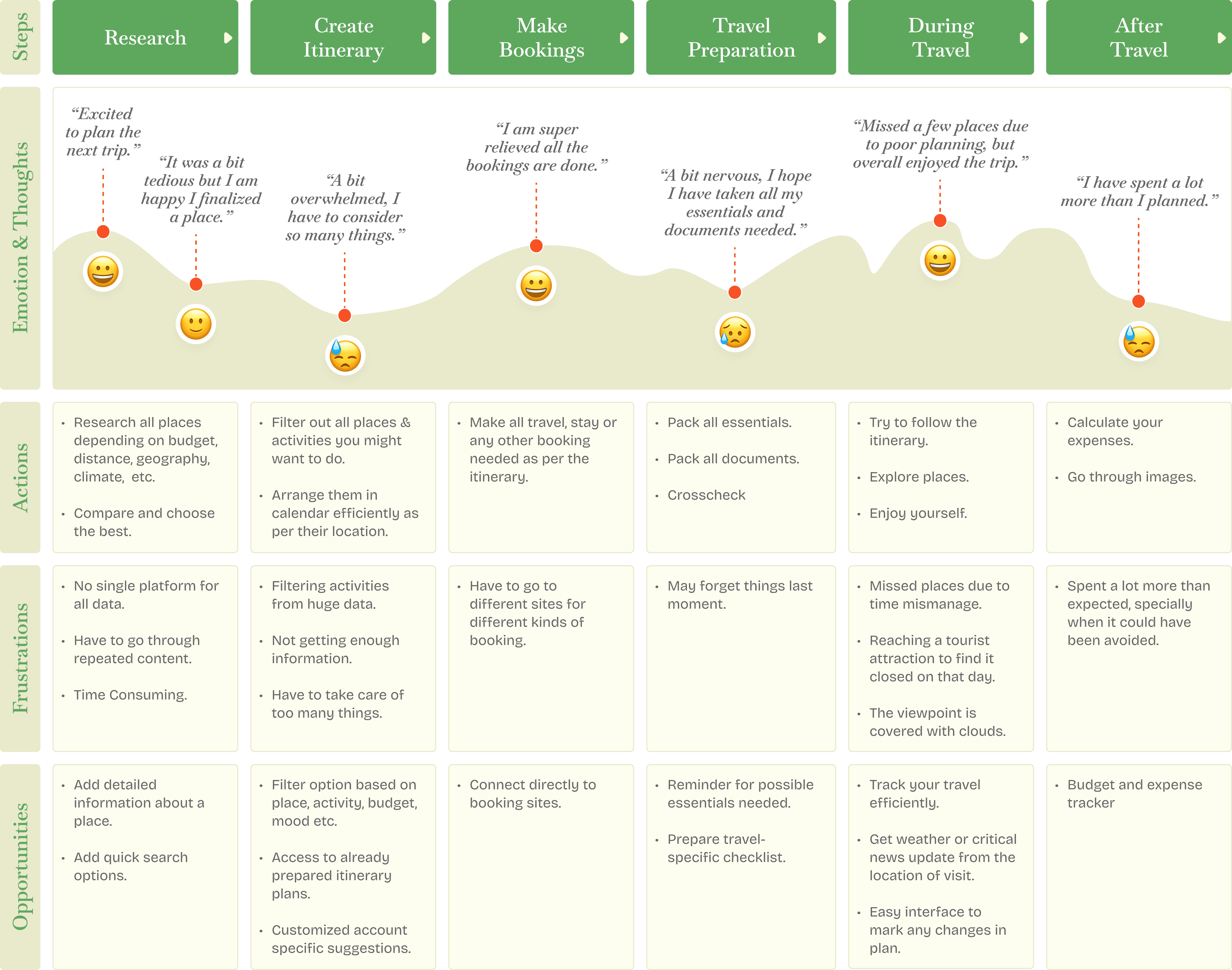
Journey Mapping

I tried to map the journey of Kaira starting from planning of a trip till the completion of the trip.
Key Research Insights for design direction

Fragmented information

Users research across multiple sources for a single trip causing confusion hence a unified platform is the core need.

Time blindness

39% find time estimation for places difficult. This is often overlooked but can be a critical feature.

Safety gap

Solo travelers, especially women, have safety concerns that apps largely ignore. Related information can be added.

Group travel complexity

50% struggle to plan for groups with different interests hence collaboration is an essential feature.

Authenticity

Users want local, authentic recommendations, generic suggestions break trust.

data Flooding

Smart filters and personalization are essential to help users find places as per their preference and to reduce data dump.

Structuring the App around how users think - Site Map

Keeping in mind the user survey and their journey map, I have mapped out the full information architecture after a few iterations based on the feedback I got. First of all I identified the 3 distinct user types for the Explore app.

Planner (current scope)

Planner (current scope)

Planner (current scope)

Discovers destinations, reads guides, and builds a personalized itinerary.

Guide Authors (Phase 2)

Guide Authors (Phase 2)

Guide Authors (Phase 2)

Authors who publishes guides for the community.

Admin (Phase 2)

Admin (Phase 2)

Verifies the creators and provides them access.

The current design scope focuses entirely on the Planner journey. The Creator & the admin flow, can be prioritized in Phase 2**.

Admin (Phase 2)

Verifies the creators and provides them access.

Information architecture of the Planner

*NOTE: Although currently the main focus is on the Planner type user, here is some thought about the ‘Guide Author’ and ‘admin’ flow. Initially guides can be seeded through partnered travel bloggers, tourism experts, etc mirroring the cold-start approach. Later Planners or users can apply to become a creator. To maintain content quality and user trust admin can verify their authenticity to allow them access. This can further be monetized through affiliated bookings, premium guides, or creator subscriptions.

Low Fidelity Wireframes

First attempt at the basic flow of the screen.

Given solo project constraints, the prototype focuses the core planner journey.

home

Home

home

Start Planning

Start Planning

Start Planning

Itinerary Generation

Itinerary Generation

Itinerary Generation

Edit Itinerary

Edit Itinerary

Edit Itinerary

Additionally Designed:

Destination Details and Guide Details, to demonstrate the full loop from discovery to planning.

High Fidelity Wireframes

Here’s the second attempt on correcting the user flow with slight changes based on the feedback I received on the low fidelity wireframes.

Visual Design System

I went for a bright warm color palette that implies adventure, energy, excitement. Where as the font nunito matches the theme of fun, friendly, and approachable. Nunito with moder, geometric poppins makes the perfect pair.

#FFF7F2

#200700

#F69934
#F84B19

#200700

#FFF7F2

#F69934
#F84B19

Testing and Iterations

After testing, observing, and receiving feedback the screens went through number of iterations to get to the final screen.

Home Screen

Initial Iterations
Changes based on Feedback
  1. Simplified navigation based on user’s task for easy discovery.

  2. Added more relevant trip details for faster plan continuation.

  3. Upcoming trip reminders for itinerary progress visibility.

Changes based on Feedback
  1. Simplified navigation based on user’s task for easy discovery.

  2. Added more relevant trip details for faster plan continuation.

  3. Upcoming trip reminders for itinerary progress visibility.

Changes based on Feedback
  1. Simplified navigation based on user’s task for easy discovery.

  2. Added more relevant trip details for faster plan continuation.

  3. Upcoming trip reminders for itinerary progress visibility.

Destination details

Initial Iterations
Changes based on Feedback
  1. Improved tab recognition by adding icons.

  2. Updated card styles for better readability.

  3. Included contextual travel information for better decision-making.

Changes based on Feedback
  1. Improved tab recognition by adding icons.

  2. Updated card styles for better readability.

  3. Included contextual travel information for better decision-making.

Changes based on Feedback
  1. Improved tab recognition by adding icons.

  2. Updated card styles for better readability.

  3. Included contextual travel information for better decision-making.

Guide details

Initial Iterations
Changes based on Feedback
  1. Improved visual hierarchy to separate content & actions.

  2. Enabled trip planning directly from the guide page.

  3. Reduced navigation effort by showing related guides on the same page.

Changes based on Feedback
  1. Improved visual hierarchy to separate content & actions.

  2. Enabled trip planning directly from the guide page.

  3. Reduced navigation effort by showing related guides on the same page.

Changes based on Feedback
  1. Improved visual hierarchy to separate content & actions.

  2. Enabled trip planning directly from the guide page.

  3. Reduced navigation effort by showing related guides on the same page.

Trip Page

was absent in initial wireframes
  1. Identified as crucial page during usability testing when users had no overview of their trips and no way to manage multiple plans simultaneously.

  2. Applies Progressive Disclosure — surfaces critical information first.

Personalized suggestions
was absent in initial wireframes
  1. Identified as crucial page during usability testing when users had no overview of their trips and no way to manage multiple plans simultaneously.

  2. Applies Progressive Disclosure — surfaces critical information first.

was absent in initial wireframes
  1. Identified as crucial page during usability testing when users had no overview of their trips and no way to manage multiple plans simultaneously.

  2. Applies Progressive Disclosure — surfaces critical information first.

Start Planning Form

Initial Iterations
Changes based on Feedback
  1. Form was too minimal missing out important information.

  2. Step form showing users progress. (Nielsen's Heuristic)

  3. Trip Vibe — personalizes destination suggestions.

Changes based on Feedback
  1. Form was too minimal missing out important information.

  2. Step form showing users progress. (Nielsen's Heuristic)

  3. Trip Vibe — personalizes destination suggestions.

Changes based on Feedback
  1. Form was too minimal missing out important information.

  2. Step form showing users progress. (Nielsen's Heuristic)

  3. Trip Vibe — personalizes destination suggestions.

Trip Planning pages

Initial Iterations
Changes based on Feedback
  1. Simplified confusing multi-step flow.

  2. Primary information made immediately visible.

  3. Categorized tabs based on 4 major pain points of a trip.

Changes based on Feedback
  1. Simplified confusing multi-step flow.

  2. Primary information made immediately visible.

  3. Categorized tabs based on 4 major pain points of a trip.

Changes based on Feedback
  1. Simplified confusing multi-step flow.

  2. Primary information made immediately visible.

  3. Categorized tabs based on 4 major pain points of a trip.

Enjoy The complete Experience

User Challenges resolved through Design.

Unified planning

All trip information now in one platform, eliminating the app juggle identified in research.

Confident decisions

Mood-based filters, trip vibe selection, and personalized suggestions reduce choices solving decision fatigue.

Plans that actually get finished

Completion indicators and trip countdowns keep users oriented and motivated to return and finish planning.

Group coordination made easy

Trip invites, shared itinerary editing, and crew management built directly into the planning flow.

Verified authors & Guides

Verified author badges, reviews, and real travel guides replace generic recommendations that 68% of users distrusted.

Better time estimations

Time estimates, route optimization, and day-by-day planning prevent the anxiety of poorly timed itineraries.

Latest Trip Countdowns

Personalized Suggestion

Itinerary planning
Easier than before

Itinerary planning
Easier than before

Itinerary planning
Easier than before

Reflections

What I would Do Differently

diverse research participants

A wider range of ages, & travel behaviors would produce more robust, generalizable findings.

Test the group planning flow

It was the second most cited pain point, but testing focused on solo task completion as it was done in figma prototype.

Constraints & Gaps

Safety features not designed

Can be scoped for phase 2 with SOS tab, real-time location and solo traveler mode.

Creator Flow & Monetization

Creator Flow & Monetization

Scope deliberately focuses on the 'Planner' journey. Verified creator, affiliated bookings, premium guides, or creator subscription model scoped for Phase 2.

Looking for A Product designer?

Let’s connect

I’m currently open to full-time opportunities from any location. If you’re looking for a designer who focuses on thoughtful, user-centered solutions, I’d love to connect.

Email me

moumandi9139@gmail.com

CALL OR WHATSAPP

9002585661

Looking for A Product designer?

Let’s connect

I’m currently open to full-time opportunities from any location. If you’re looking for a designer who focuses on thoughtful, user-centered solutions, I’d love to connect.

Email me

moumandi9139@gmail.com

CALL OR WHATSAPP

9002585661

Looking for A Product designer?

Let’s connect

I’m currently open to full-time opportunities from any location. If you’re looking for a designer who focuses on thoughtful, user-centered solutions, I’d love to connect.

Email me

moumandi9139@gmail.com

CALL OR WHATSAPP

9002585661

Thanks for taking the time to look over my portfolio.

© 2026 Mousumi Mandi. Designed & built with love.

moumandi9139@gmail.com

9002585661

Thanks for taking the time to look over my portfolio.

© 2026 Mousumi Mandi.

Designed & built with love.

moumandi9139@gmail.com

9002585661

Thanks for taking the time to look over my portfolio.

© 2026 Mousumi Mandi. Designed & built with love.

moumandi9139@gmail.com

9002585661

Create a free website with Framer, the website builder loved by startups, designers and agencies.